Craftnote App
About the collaboration
After we've sucessfully worked together on the first engagement for the Craftnote user management, we knew that we wanted to keep working with each other. It was my and our clear plan from the beginning to make it a limited time engagement, though. Not because we didn't enjoy working together, but just for the fact that both craftnote and I knew that with a product as their's, they needed the skills I provided internally and inside their growing product team as quickly as possible.
My role at Craftnote
That is also one of the reasons why our engagement changed over the months and years: Starting out I was hired mainly for UX consulting and UX strategy what quickly lead into UX Design work (the clear focus of my contribution) supplemented by some UX Research and later on also some UI Design work. For the last part, the UI Design part, I need to add that (as far as I know) none of my Designs for the mobile App ended up inside the App. Just so you are not confused why the designs you will see here don't look familiar. Finally and to end our collaboration, I helped out a little bit with recruiting.
Vision, product market fit and strategy
Over the time we worked together, we added quite a few new features to the app and also redesigned some of the existing parts. We added the task and document management, improved the user management, worked on the onboarding and the integration of manufacturers, added time tracking and more.
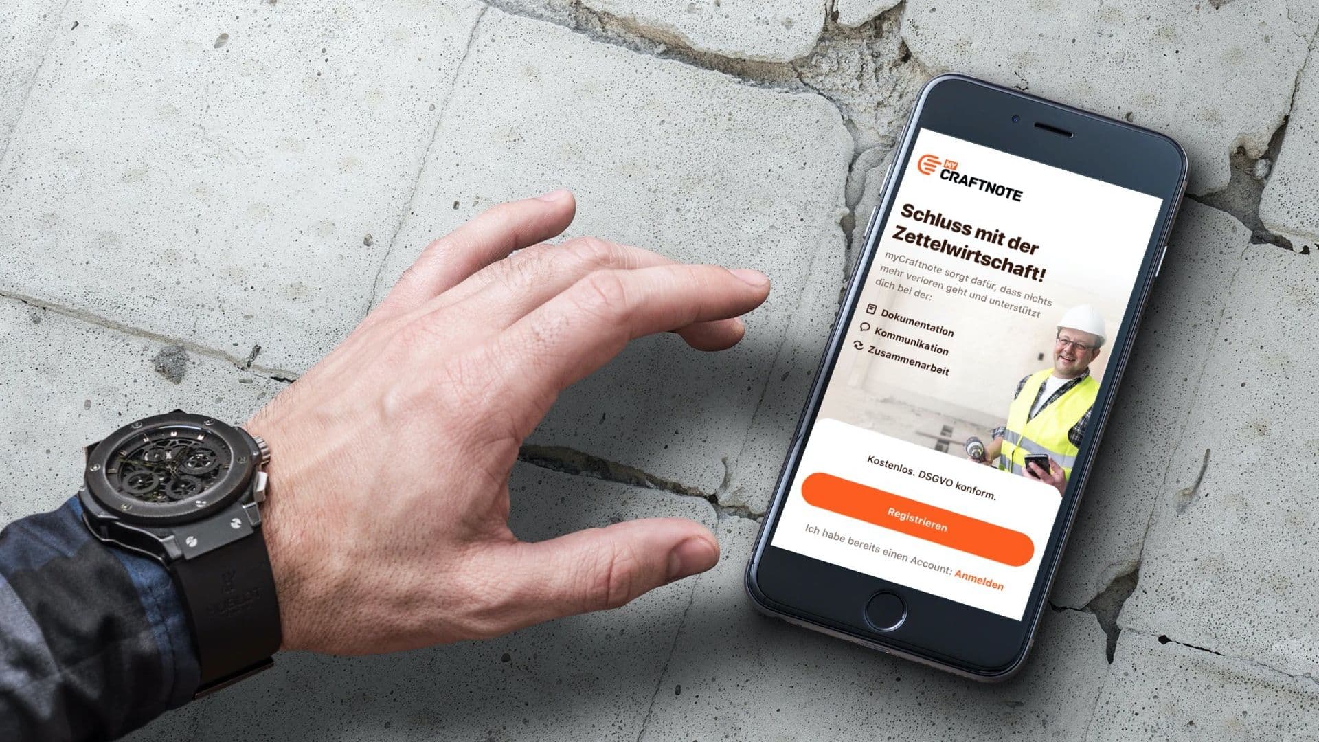
Right from the start my wish was to help to take the app from it's solution-focused "WhatsApp for craftspeople"-vision to fullfilling it's full potential as a tool that serves the unmet needs of craftmen in regards of communication, planing and collaboration. Craftnotes idea to solve these through a chat was genius, since the target audience was already using WhatsApp but were very unsatisfied when it came to it's security. Nevertheless: When it came to fullfilling the need for control, planing and documentation, I always saw some clear flaws in the chat-based solution due to it's linear nature and therefor a huge potential to create a better solution for the big existing market. The wish to seize this potential was my biggest driver when working together with Craftnote.
UX Research
The great thing about Craftnote is, that they are living and breathing customer centricity. From both CEOs to every single employee. I think I never encountered another team that was as connected to their users as Craftnote. They knew them personally, had phone calls reglarly, wrote emails with them daily and even visited them on quite a regular basis.
For me that made things much easier for to two reasons:
- A lot of the needed insights could be gained through the accumulated knowledge inside the Craftnote team. And when we were working on a feature and time was very limited, we could (at least kind of) make sure to have the customer view at the table by having the teams knowledge at hand.
- In case we needed to get insights or feedback directly from the customers, it was very easy to get that – even if it meant visiting them.
Therefor my research activities could be kept to a minimum, which mainly were some customer interviews (during a traids fair) and on-sight interviews/contextual inquiries and desk research.
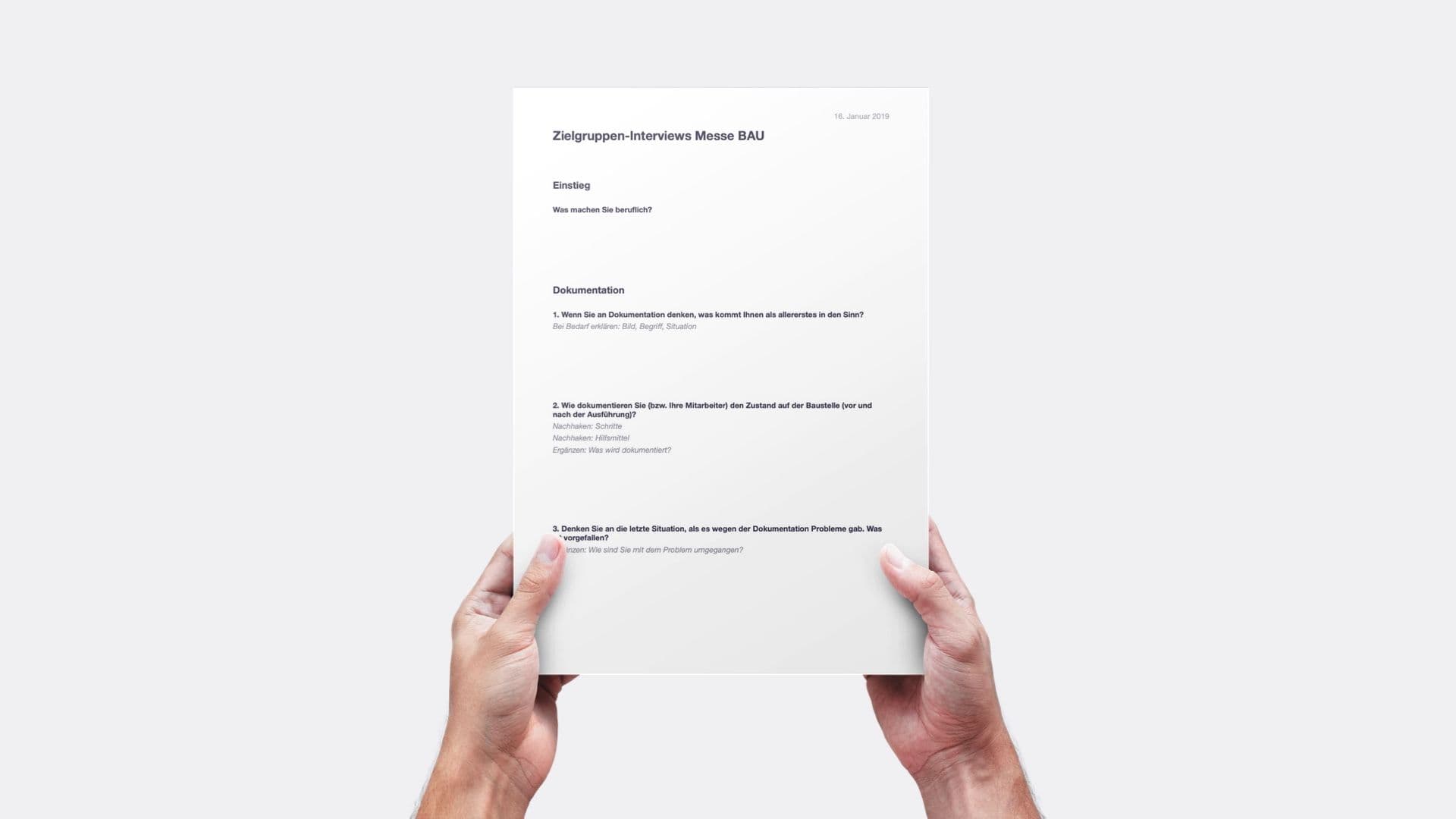
Wireframing & User flows
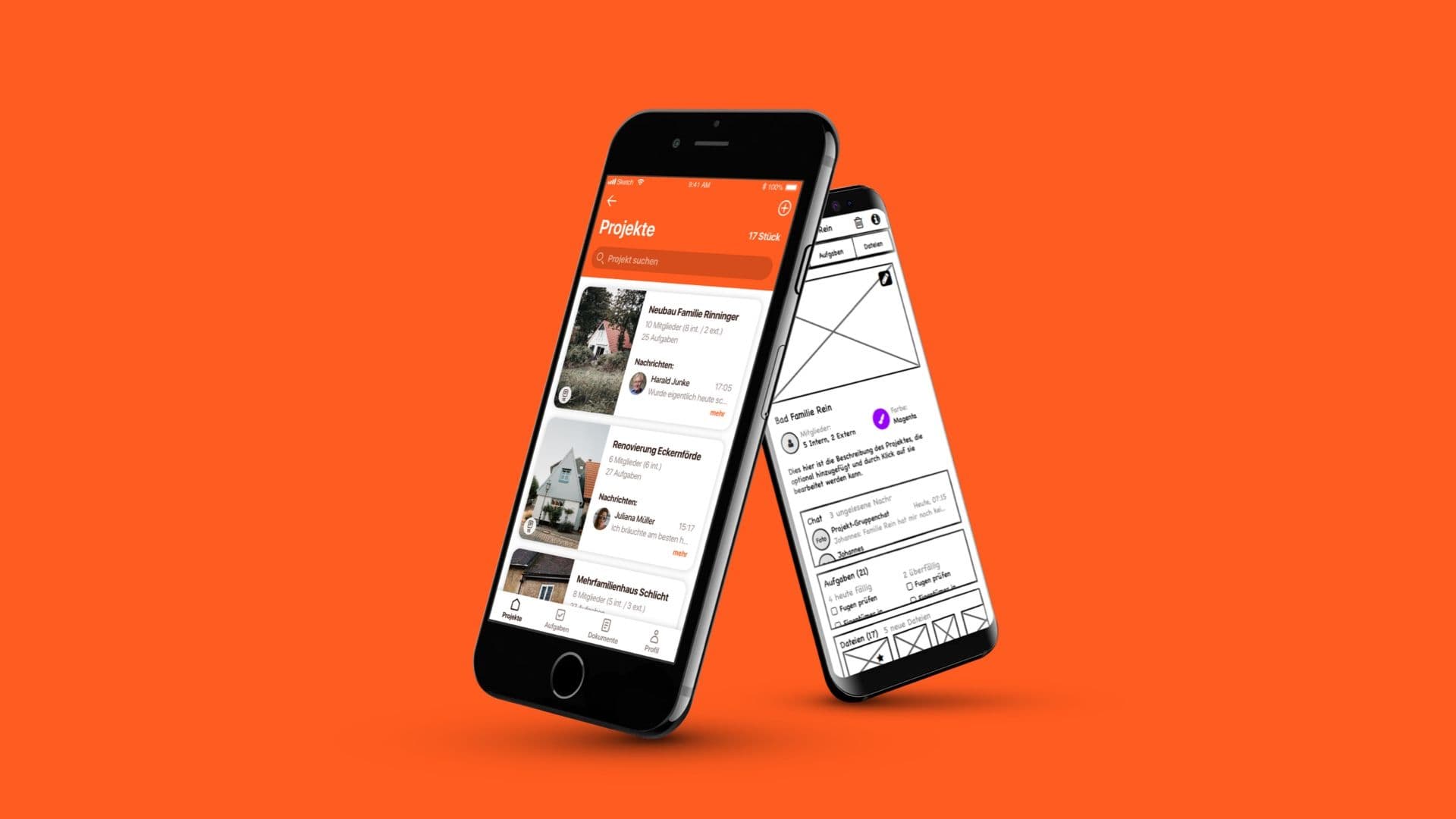
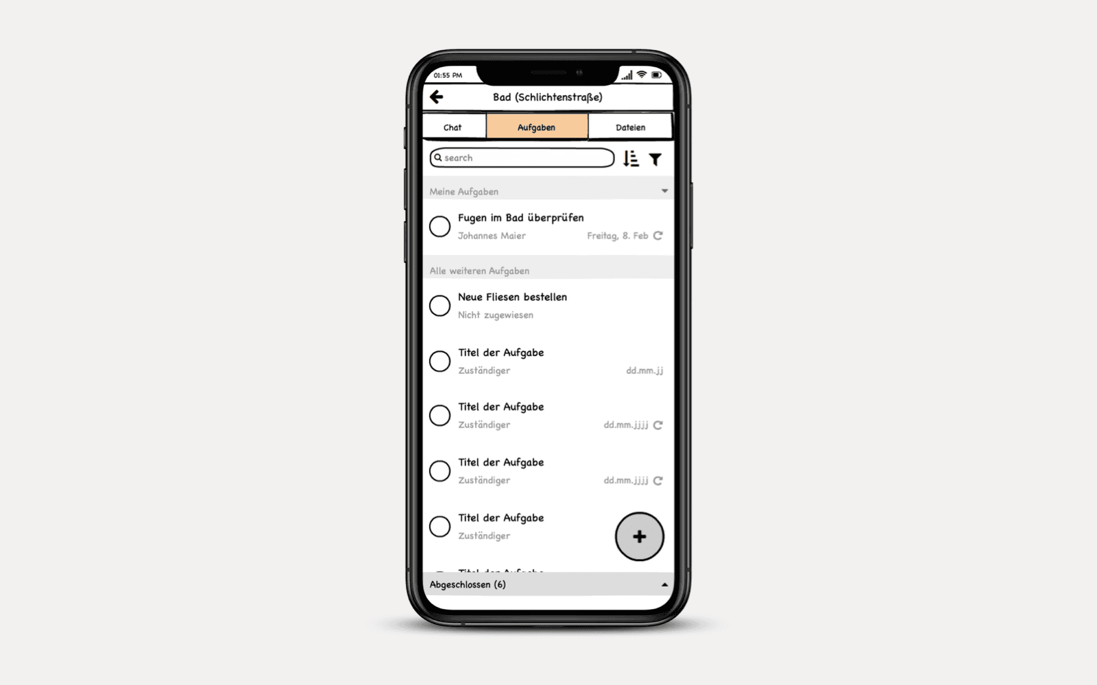
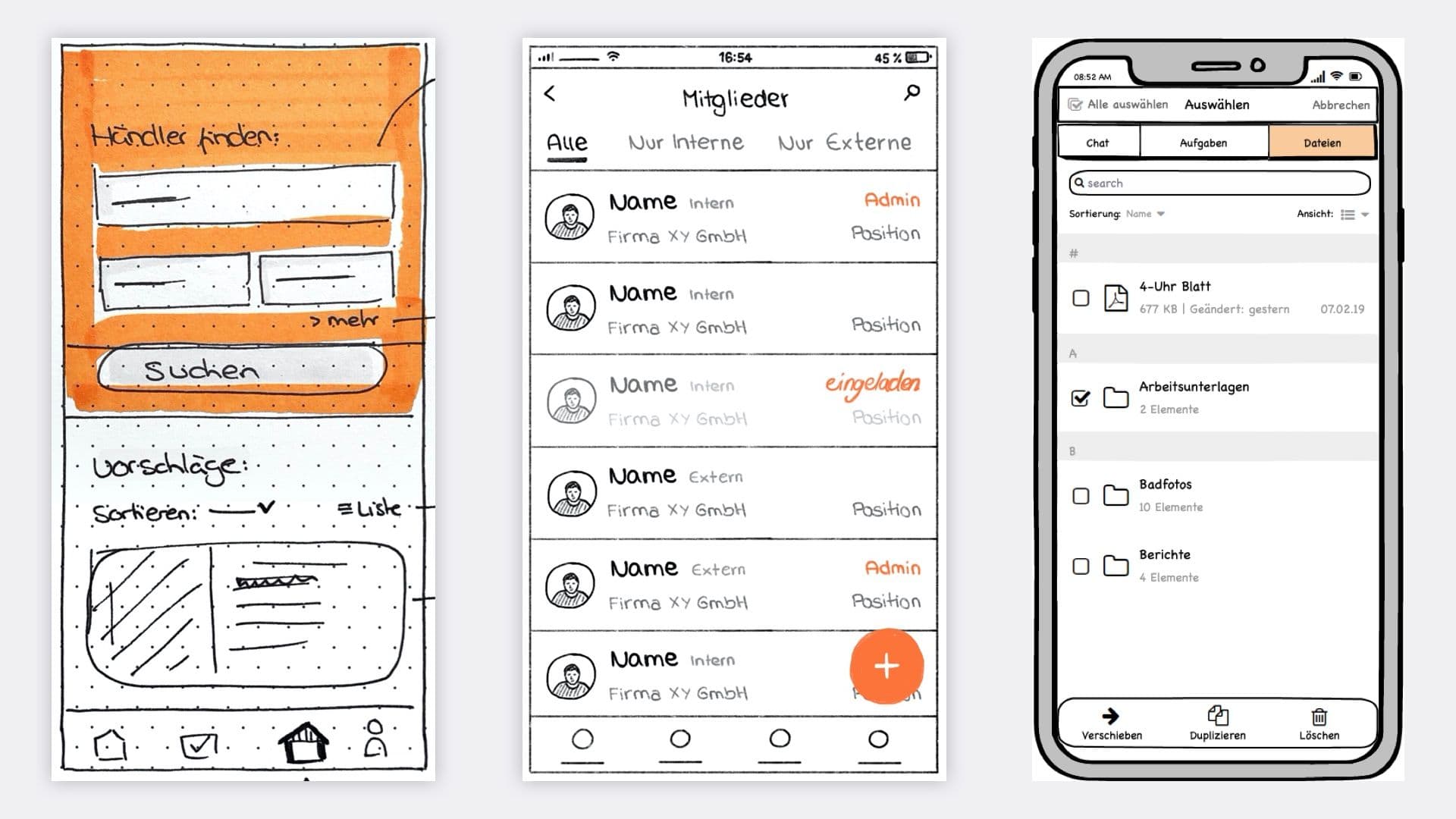
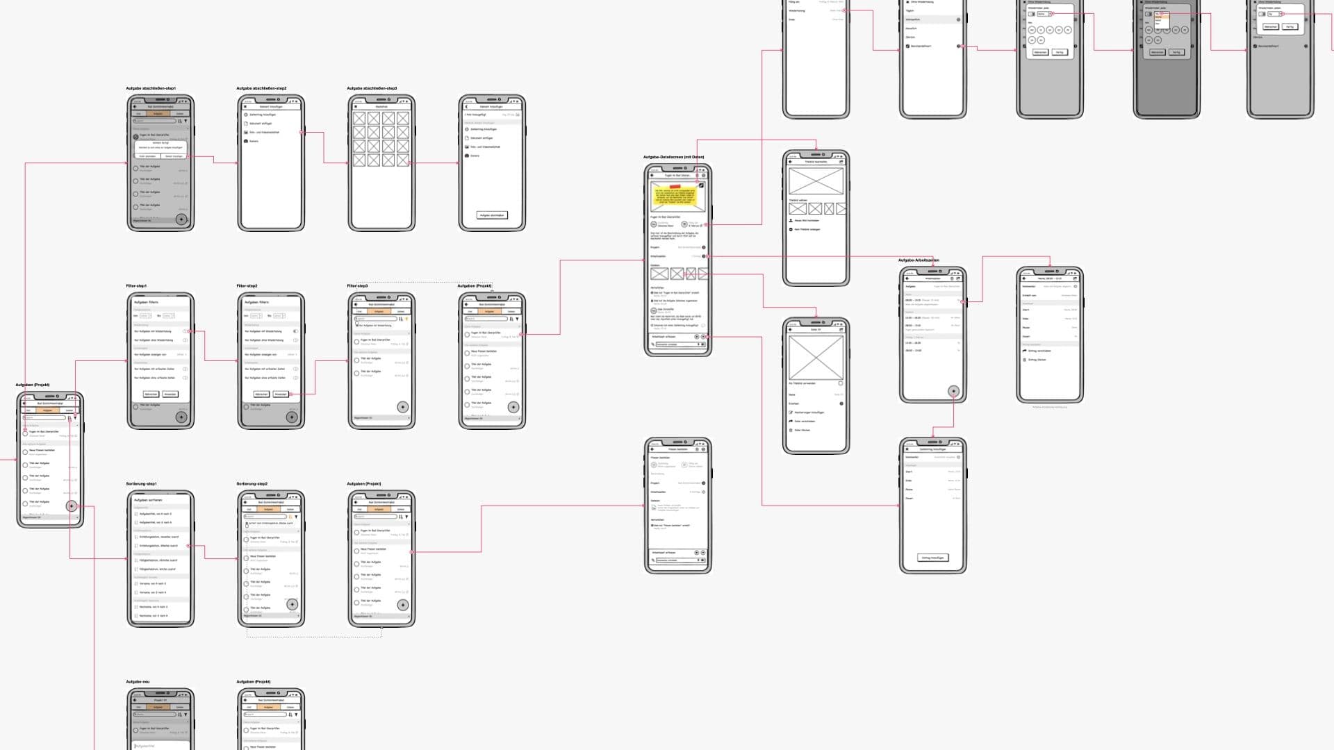
I guess when I would have to name one kind of deliverable that I produced most during our engagement, it must be wireframes and user flows. From hand-drawn wireframes, to Balsamiq Wireframes, to Wireframes drawn on the iPad to Sketch Wireframes. But that is no wonder since my main goal was to help with the concept, structure and overall User Experience.
UI Design
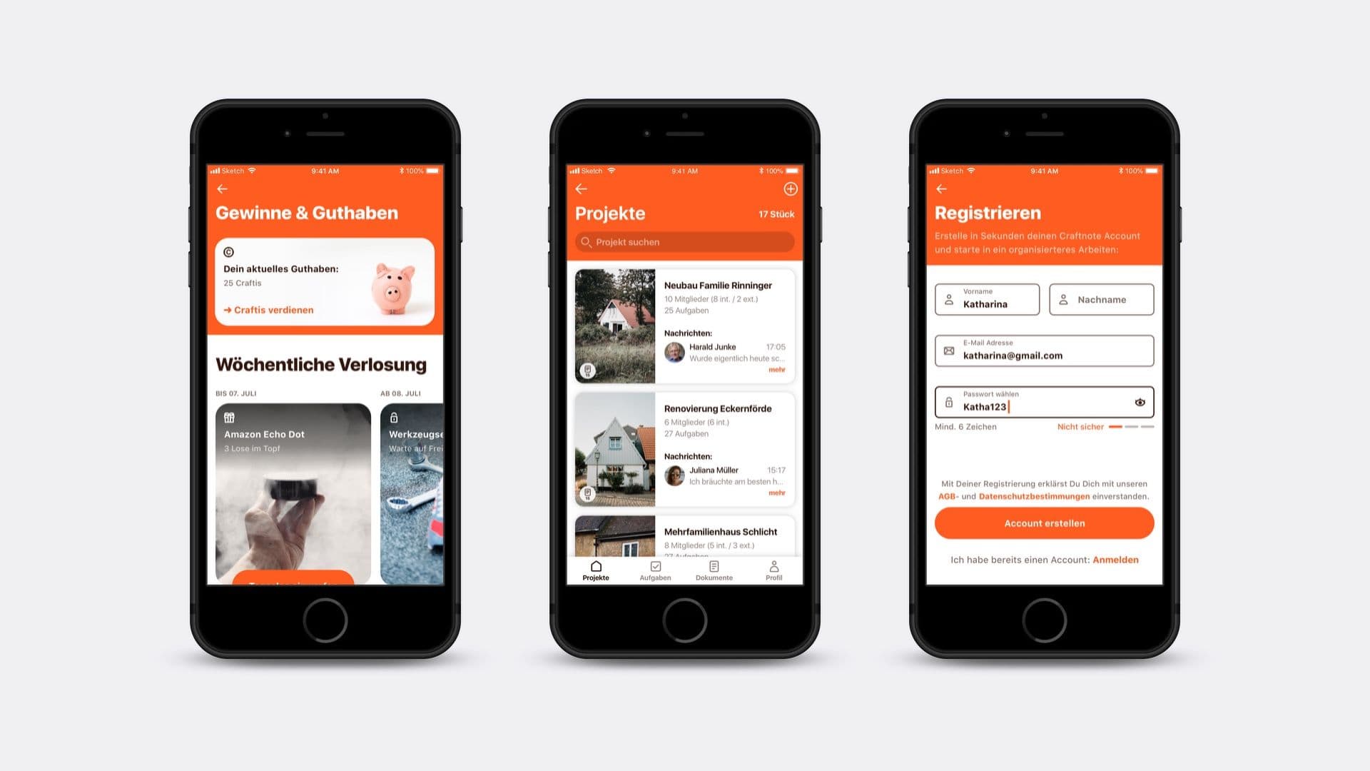
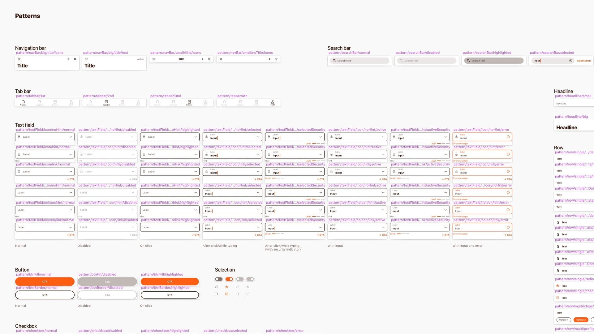
As mentioned before, I also did some UI Design work for Craftnote and even created a small pattern library in Sketch. But this was clearly not the main focus of my contribution. As far as I know my UI design won't find it's way into the app. There never was the right time for a huge shift and investment in develoment time for a redesign. And since we knew that we wanted to quickly build up the UI Design capability inside the Craftnote team, it finally made sense to not invest further into design produced by an external contractor (me/us). Nevertheless I want to show you some of the designs I produced over the years.
