homee Onboarding
About the project
The homee team realized that they had quite a high return rate. Meanwhile the app analytics showed that many users did not succeed with setting up their new homee. So we formed two hypothesis:
- The high return rate is connected to unsuccessful and/or uncompleted setups.
- The steups are unsuccessful and/or uncompleted because the app fails to guide the user in an understandable and comfortable manner.
The outcomes (business as well as user outcomes) we wanted to achieve were the following: Increasing the setup success rate, reducing the setup time and decreasing the return rate.
Analysing the current setup process
We started off by going through the current setup process. By the way: I came up with that almost 6 years earlier as you can read in this rather old case study on the first redesign of the homee app.
As you can see in my notes from this meeting, I tried to highlight points of possible friction and potentially unneccesary steps. Therefor it was very helpful that the iOS and Android developers were present in this first meeting.
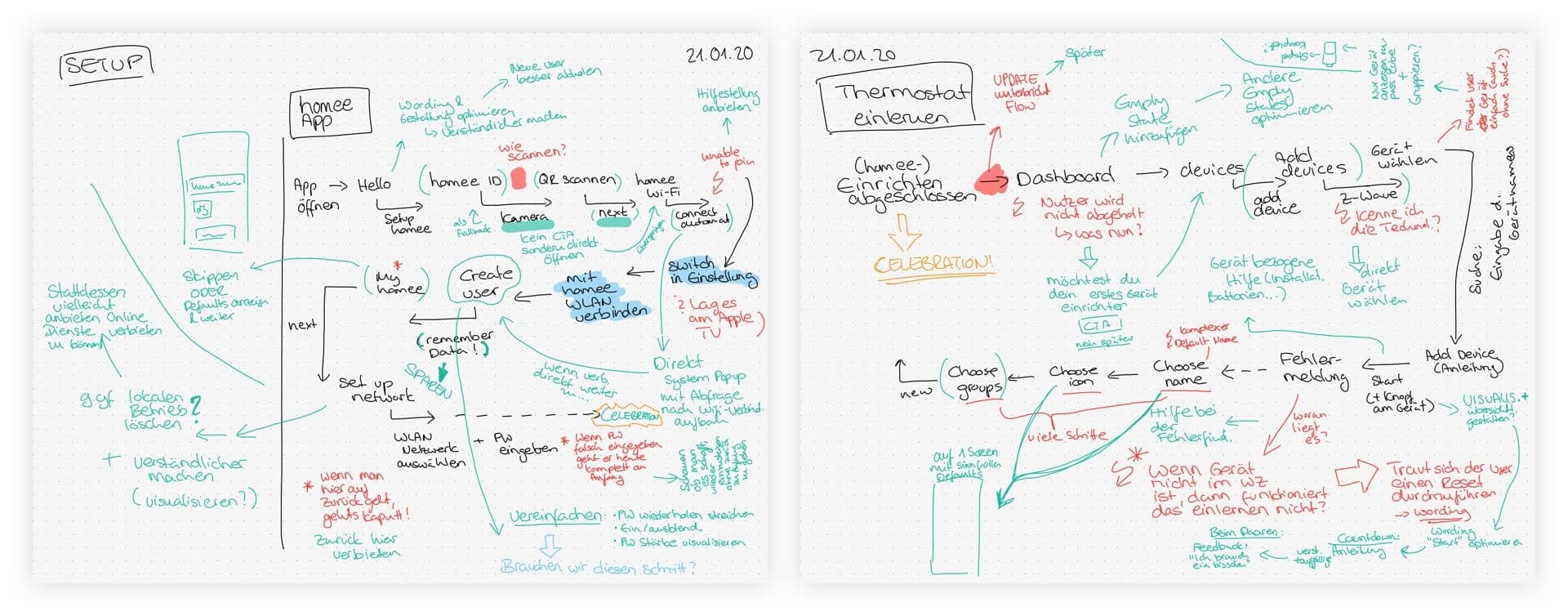
Sketching the setup process and creating tree diagrams
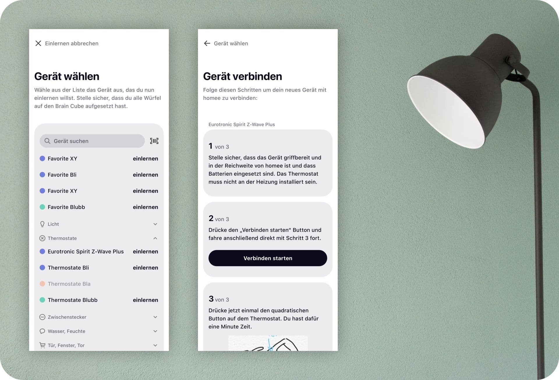
After this meeting I sat down and thought about how to improve the process and created a first user flow with very rough wireframes/sketches that I would later discuss and improve on together with the rest of the team. Meanwhile I asked the developers if they could somehow write down all the necessary steps from a technical standpoint and also include the different resulting steps that could accurr. They created an amazing tree diagram for us that showed all the possibilities that needed to be accounted for.
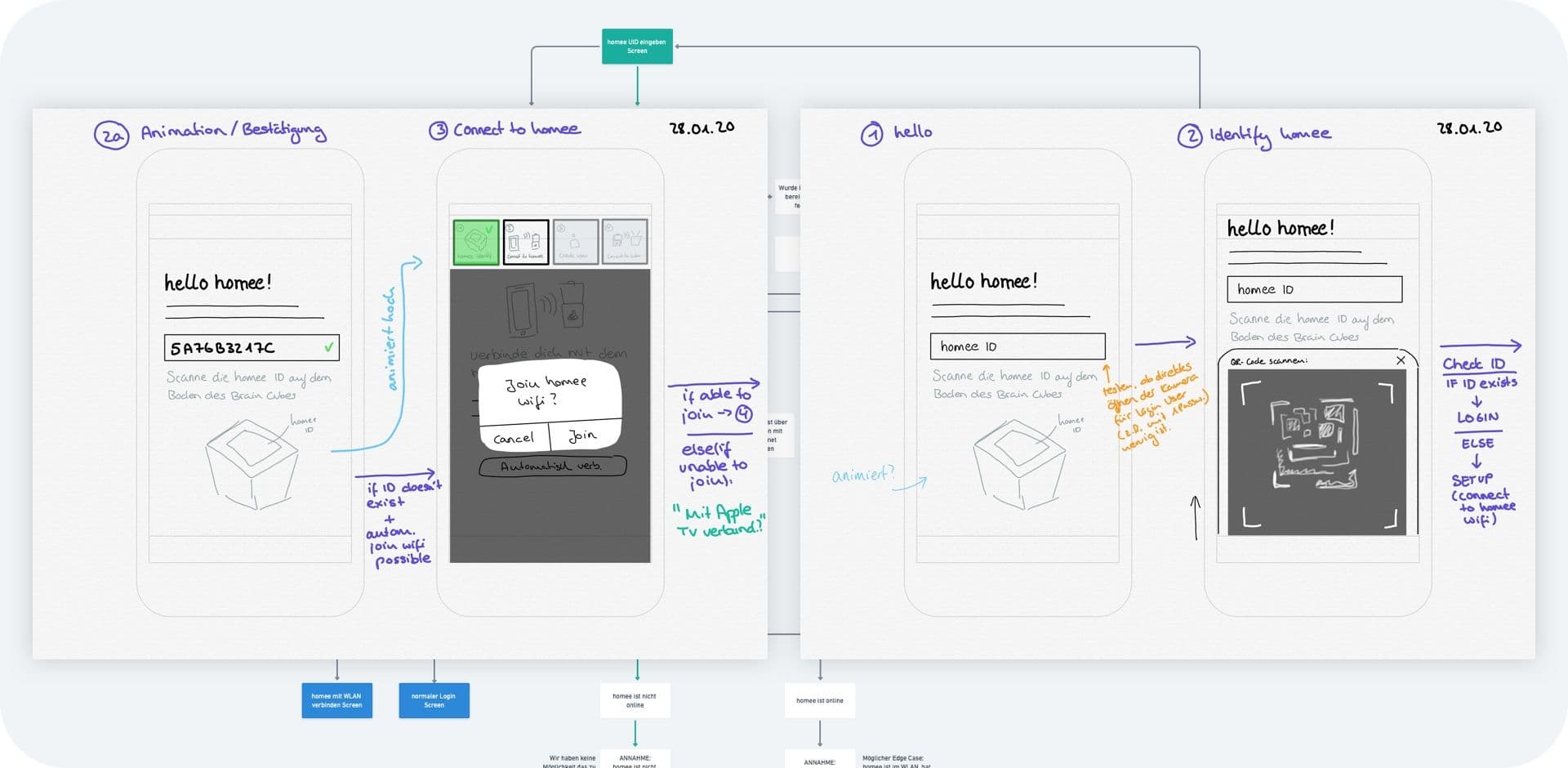
Reducing friction
Regarding our product hypotheses we saw several ways of how to solve for the outcomes mentioned in the first paragraph. One of which being to reduce choice and thereby mental overload. We did this in several ways:
- We completely took away unneccesary steps. An example for that would be that we removed the personalization of the homee (choose icon and give name). This option will still be available through the settings but it is not a part of the setup process anymore.
- We also litereally took away choice by deciding for the user based on their input. An example here would be that we don't ask the user if he wants to setup a new homee or login anymore. We now decide this based on the homee ID he types in or scans. Since that is a step required in both instances we make use of this information to unburden the user.
- And lastly: we visually emphasized the default choice. An example here would be the wifi option (vs. the LAN option).
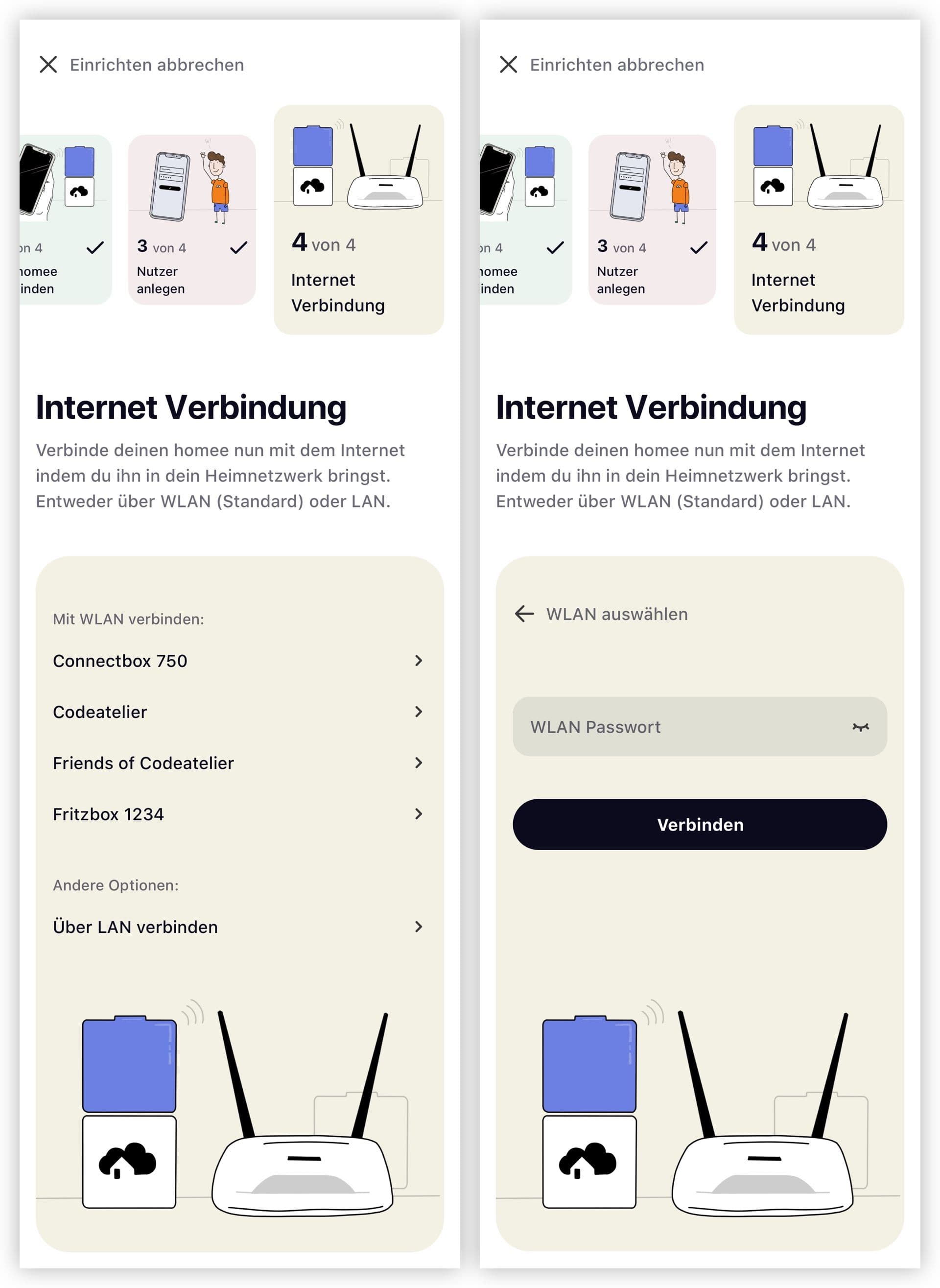
Illustrations and progress indication
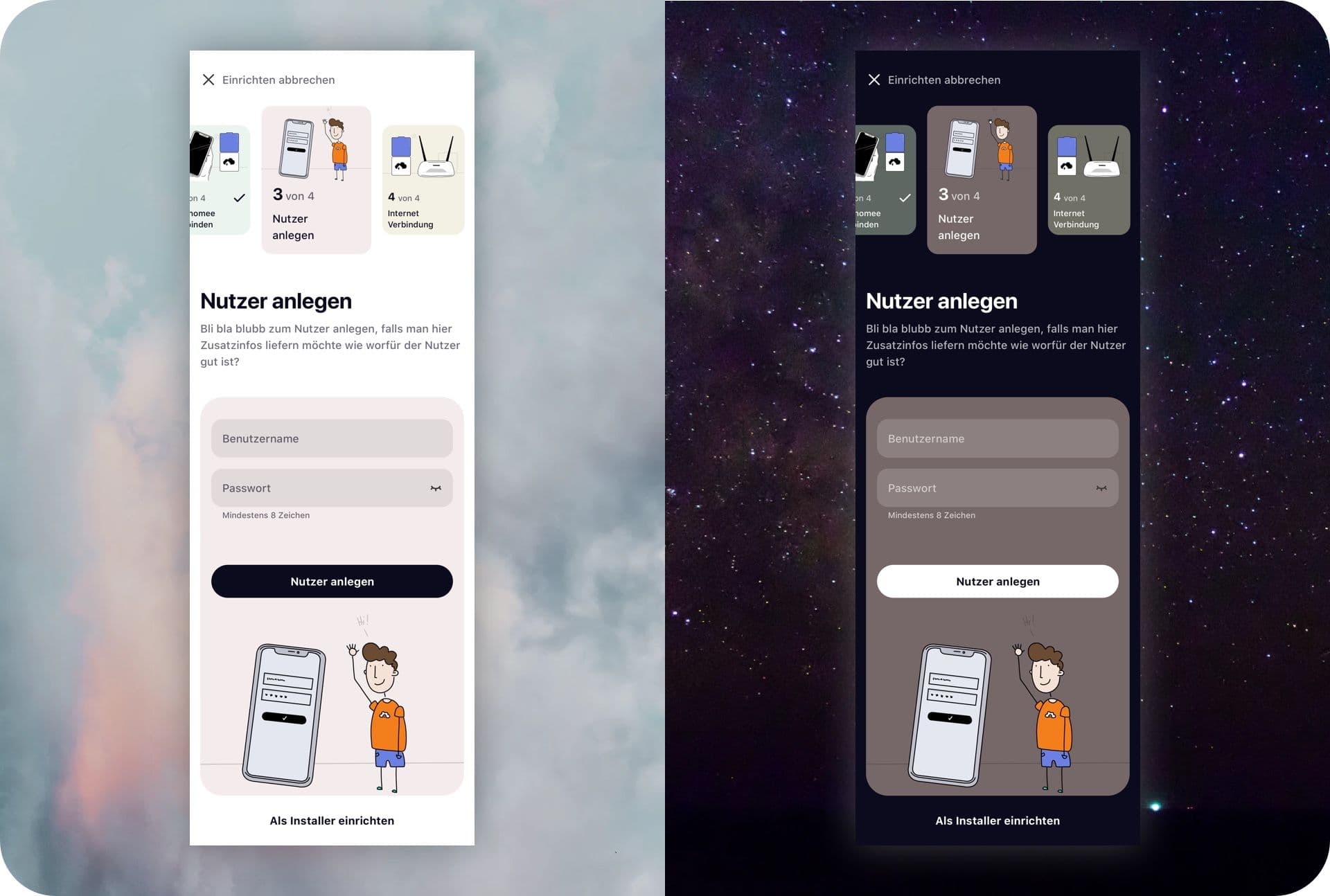
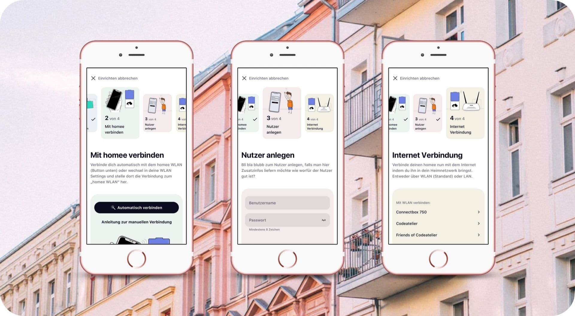
Another important new element are the illustrations. They are supposed to clarify the steps the user needs to take. Since the setup is quite complicated and I know from experience that users often don't understand the specifics of them (like for example the difference beetwen connecting the Smartphone with the homee wifi and later connecting homee to the local wifi) I assume the illustrations can help with this.
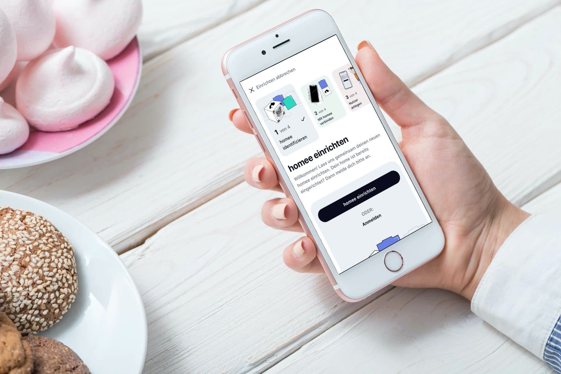
Besides illustrations I also added a progress indicator to the setup process. Here I decided to go for little cards that are displayed in the top section and contain the illustration, number of the step and a short text explaning what the user is doing in this step.
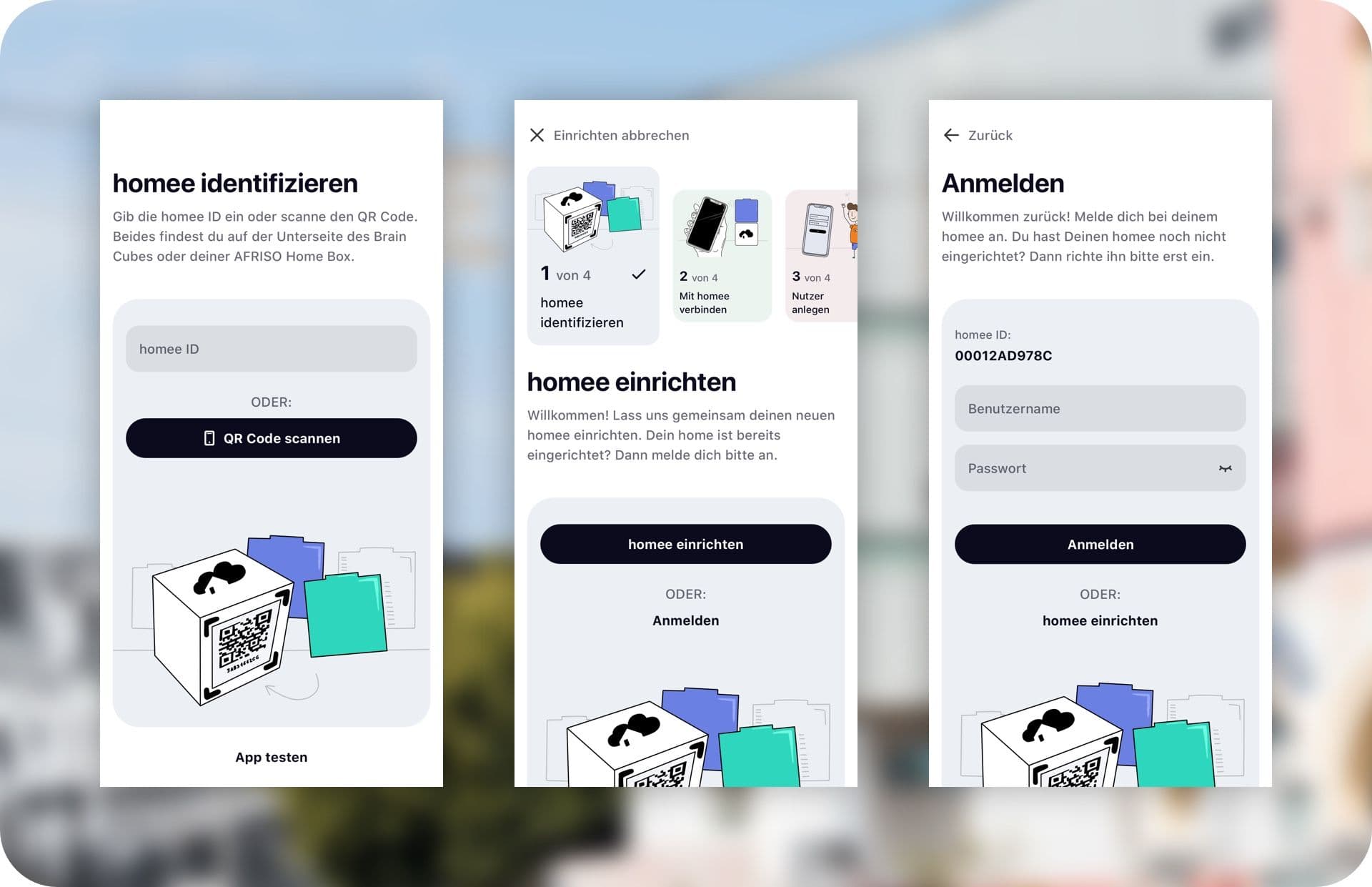
Outlook
While I am writing this case study we are still working on the onboarding improvements. That means we still need to see if the meassures we took will create the outcomes we aimed for. The next steps will be to implement the new process and see if the metrics change in the way we assumed.
